Quicktime H.264
(29mb)
iOS Compatible
(9mb)
Watch in Flash
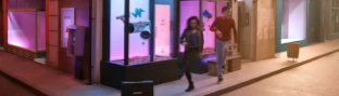
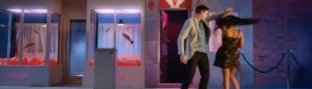
Created by Les Télécréateurs for French public service channel France 5, these idents are damn near perfect in their simplicity.
The concept is as simple as it is strong; a multitude of things that move in the same direction, one following the other, like a chain reaction between completely different worlds. Its underlying meaning is stated loud and clear: knowledge derives from making new links.
Understated and engaging, you can see more from the channels branding here.