Download the whole H264 bunch in one swoop here (36.3mb *.zip).
> Quicktime H.264
(6.1mb)
> iPod Compatible
(3.2mb)
> Watch in Flash
(2.6mb progressive)
> Quicktime H.264
(3.8mb)
> iPod Compatible
(1.8mb)
> Watch in Flash
(1.7mb progressive)
> Quicktime H.264
(6mb)
> iPod Compatible
(3.7mb)
> Watch in Flash
(2.7mb progressive)
> Quicktime H.264
(5.8mb)
> iPod Compatible
(2.9mb)
> Watch in Flash
(2.6mb progressive)
> Quicktime H.264
(5.9mb)
> iPod Compatible
(3.1mb)
> Watch in Flash
(2.6mb progressive)
> Quicktime H.264
(5.8mb)
> iPod Compatible
(5.3mb)
> Watch in Flash
(2.6mb progressive)
> Quicktime H.264
(3mb)
> iPod Compatible
(1.2mb)
> Watch in Flash
(942kb progressive)
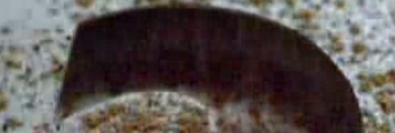
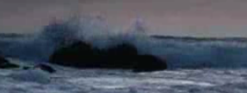
Update 08/04/07: Sunroof ident added.
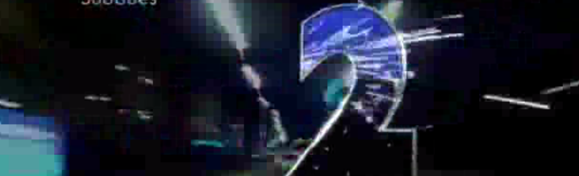
BBC Two, the channel that delights me on a weekly basis with new episodes of Top Gear (promo below) relaunched its on screen look over the weekend, and I feel a little conflicted.
Maybe as an outside observer I can’t gauge how sick people may have been of the old look idents, but I still really liked them. They were easily the best entirely computer generated idents out there, and used a formula with seemingly (or I guess not) endless variations.
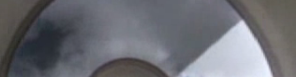
My favourite of the newbies is probably the zoetrope (first video), they could have even expanded that into a whole series with different projections being made. For now though, try and let the new teal coloured logo grow on you as you soak up the new look.
> Quicktime H.264
(2.1mb)
> iPod Compatible
(1mb)
> Watch in Flash
(993kb progressive)
25 replies on “TV on the television: The new BBC Two idents”
I absolutley like the new BBC Two Idents! Especially the fact that each individual idents now puts the right mood for the upcomming programme.
You do know that there are different variation of each idents, making it total of fourteen idents total, and probably more on the way….
I have to say, I’m loving these new idents. I had thought the old ones were, as loveable as they were, feeling a little old now, so I’m really pleased that they’ve replaced them with such tremendous new ones. They’re orientated towards the programming, and they do look visually impressive. But which one did they use before Top Gear?
Its the best of both worlds, both previous incarnations merged together to create a similar if not up to date feel.
We now wait to see what happens to BBC Three, BBC Four and the BBC’s children services (Since there are plans to split Children’s programming into three)
This is not the whole bunch…
I’m not a big fan of these. They remind me of the BBC idents two ‘generations’ back, which were fantastic. Red Bee Media are brought in to make far too many idents, and they’re just not hitting the mark!
What happened to a time when a channel would just use one perfectly created ident? I remember a time when BBC Two was considered to be breaking the mould when they used a different one for each programme!
I LOVE these. Especially mirror. It is absolutely beautiful.
It makes me want ABC2 to get some new ones!
BTW, Ornsack – Red Bee Media had nothing to do with these idents. They were created by a different company.
RED BEE did produce these but not created by them, they only did the concept.
Quote from Media Guardian:
The idents have been designed by ad agency Abbott Mead Vickers BBDO with production by Red Bee Media.
God I hate RED BEE, it’s always bland with them.
Umm, if AMV BBDO ‘designed’ them, and Red Bee only ‘produced’ them…then you can’t blame Red Bee for them being bland. They were operating under orders!
Not that they are bland, anyway.
It’s taken some time but i think Red Bee is finally getting to grips with being independent.
I think I may be the only one who thinks these new BBC Two idents are somewhat a desapointment (I sure liked the “2”‘s from norway better than these “2”‘s)…It feels as if BBC Two went back to their old 1990’s idents (though, they are still great) and like I said in another post, there is no uniformity with BBC One (for example: you see all ITV channels having an uniformity in their logos, so; if this is a new era for BBC idents, why not having BBC Two just like the new BBC One? At least they should had changed the fonts). I was really waiting for something more innovative from BBC Two…sorry for being so critic…
The press releases also talked about BBC2 inviting people to make their own and submit them online – think it said they’d be putting a ‘2’ template on their site for people to download….could be interesting…
identical, *that* is very interesting indeed…here in Italy, Mediaset made something similar (but more like home-videos, so they aren’t nice to watch): many short videos or animations where someone screams “Italia 1!”
one word…wow
Using the 2 as a frame is a bit too close to Channel 4 idents for my liking. The BBC really need to pick up their game, they’re just looking a little drab.
I love these idents, but I hate the box. There’s so much inconsistency now across the BBC – BBC one has a unique, modern-looking logo, two, three and four have their logos stacked in coloured boxes, BBC World and News 24 have gone back to the hold horizontal style and BBC America has just relaunched with idents that don’t have a BBC logo, but something completely different – an ‘a’ in the middle of the screen. I wish they’d get some uniformity – the relaunch of BBC Two was a missed opportunity on that front.
ps. There are different versions of the idents above. ‘Chase’ for example has another version where the 2 is cut out of a floor and the man climbs up through it. The theme is ‘windows on the world’. A new one has just been shown of a football being sprayed through a stencil – it’s really shoddy and lets the package down.
You might be missing the variation two of the coffee ident, which is dropping the two sugar cubes, and stirring it. Also, like Nick said, there is two more variation of chase idents, the shorter Zoetrope ident, and etc.
Also, in first press release, BBC announced that the best mock would be used as an ident, but that info was removed at last minuiet. (I know this, because my friend works for the BBC) So, I’m not suprised that the special ident was used…
There are a total of 5 different chase idents, and about 8 mini dents for chase too. they should be gradually released….
Just wanted to disagree with the comment on the football one being shody. I think they completly got the wrong idea about it. personally think its genius!!
Even though I don’t watch TV anymore, you can’t help but miss the old idents from the 90s.
http://en.wikipedia.org/wiki/BBC_Two_1991-2001_idents if you don’t understand what I mean.
Can anyone tell me the name of the track used for the sunroof ident? This was used on a toyota corolla advert about 10 years ago and have been after knowing what it is ever since. Someone please put me out of my misery!!
Javier,
I too have loved the sunrrof ident song since it featured in the toyota advert 10+ years ago… I can still remember this advert vividly but have never been able to find the name of the track – so IS there anyone out there who can help me us find the name of this tune
Another person (http://www.thedjlinkdomain.co.uk/whatsthattune.htm) has been trying to… but no joy either!
PLEASE PLEASE HELP!!!!
THe music was created for the BBC2 idents so it must just sound very similar to the old toyota track..
That was pretty good, I’m glad they kept the world-famous 2.
But for that teal smudge…
*vomits*
The music was not created for the BBC2 idents, it was originally on the advert for toyota carolla on C4 10+ years ago as stated by paul writing to javier, i seen it and heard it and love it and there was more to it then. BBC2 sunroof ident is just a small part of it, these metal robots in a desrt and an ice cream van with someone squirting both mustard and ketchup accross the ice cream man out of the window of a toyota carolla, and we need help to find this track, please help channel 4
I have been trying to find out the name of the track too!
Every now and then in pops in my head,i go online to see if i can find it then nothing!
I cant find the advert on youtube anymore either!!