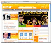
In April 2006 the BBC ran a competition asking for a new design for the frontpage of their crazy popular website bbc.co.uk. I entered that competition and was one of ten runners up. My design for the site scored me a iPod Nano which I later gave away to a reader. The BBC has finally launched a beta version of the new look front page and its available for the worlds criticism here.
I have to say I really like the new design, not only because they finally centered the layout of the site, but also because of the bold use of colour. Clicking any of the four tabs in the main promo space changes the entire palette of the site, a feature I’m sure some will hate, but if it makes it beyond the sites current beta phase will be an audacious move.
The analogue clock in the top right of the page pays geeky homage to the old test cards of the sixties that once graced the screens of the BBC. The addition of the clock has been described by the BBC as “initially punted as a bit of fun, but feedback revealed that users find this icon, a homage to the “golden days” of analogue programming, bizarrely reassuring.”
Read more about the new design from the man responsible for it here, overall I’m really impressed, and hope that the new look abc.net.au whenever it comes about will bring with it the same sensitivity and venturesome the BBC have delivered.
6 replies on “New look bbc.co.uk beta now online.”
Actually, it’s a lot better than I expected it to be. I like the way you can get rid of stuff that is of no interest to you and the local stuff (like automatically giving you listings for local radio) is really good. Plus you can now have Celebdaq updates on the homepage! 😀
Brilliant design, a much improvement. Only thing is the search box is a bit too prominent and makes it sort of look like one of those “portal” sites like Yahoo, which BBC should definitely stay away from. The search box is much to prominent considering it probably is not used very much.
And also, I don’t like how the whole page changes colour when you click on the tabs. It doesn’t work because the tabs only change one small section of the page – so why should the rest of the page change colour too? The different colours don’t look bad as such, but the way change when you click on those specific tabs is not very good.
Awesome. I was wondering whether we’d ever get to see this, but wow.
As just about everyone else is saying, the section headings are a tad chunky. In fact, I find most of the fonts are a tad large for my liking.
But the content and layout are great – they’ve been sticking to the narrow fixed-width layouts for too long now.
I can’t wait for the user accounts system, because I clear my cookies all the time. 😀
I also have to agree that it’s better than what I expected. Not only for the bright colors and the homeage for the ol’ BBC clock, the site’s update to a “web 2.0” oriented site is an emprovement; though, i’m not a “web 2.0” fan…I sure hope the BBC doesn’t turn into some kind of “my yahoo” site. A good thing is that they knew how to keep it’s design to a reasonable amount of “content boxes” (not like yahoo). Anyway, it gives you a “new” and innovative sensation once you enter the site. I like that :3 also, I like the yellow…I wonder what would had happend if they had choosen john’s design…
Well, considering what the winning design was, I think they’ve still got a lot of work to go – I remember that one of the things that helped that design get chosen was its “you – bbc – everyone else” slider.
Damn, I can’t wait for user accounts. Integration with the DNA Hub (in particular h2g2) would be great, too.
On the whole BBC 2.0 plan – a couple of days ago, I found this slideshow about the Beeb’s “15 Design Principles” by Tom Loosemore of BBC Future Media & Technology. It’s pretty interesting.
Hmm… it looks unfinished and a bit Fisher Price to me. Also, it looks huge on a resolution of 1920×1200 so on a 1024×768 standard res, it may be a bit overpowering. I’m not sure the CSS changing the colour scheme works either – the relationship between the colour and the content doesn’t seem to have any relevance, which would have been a good way of visually separating things out a little.