Download the whole H264 bunch in one swoop here (56.4mb *.zip).
> Quicktime H.264
(8.9mb)
> iPod Compatible
(4.3mb)
> Watch in Flash
(2.4mb progressive)

> Quicktime H.264
(10.9mb)
> iPod Compatible
(5.6mb)
> Watch in Flash
(2.3mb progressive)
> Quicktime H.264
(7.6mb)
> iPod Compatible
(3.9mb)
> Watch in Flash
(1.7mb progressive)

> Quicktime H.264
(7.5mb)
> iPod Compatible
(3.9mb)
> Watch in Flash
(1.6mb progressive)

> Quicktime H.264
(8.7mb)
> iPod Compatible
(4.5mb)
> Watch in Flash
(1.8mb progressive)

> Quicktime H.264
(13.1mb)
> iPod Compatible
(6.5mb)
> Watch in Flash
(2.8mb progressive)
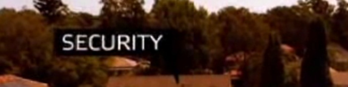
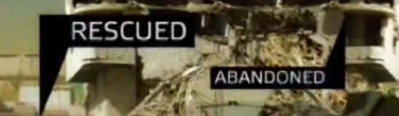
ABC1 idents have always been a little hit and miss. This latest release though, which started to appear at the beginning of the month have been the most polished, coherent and unified I have seen from the national broadcaster since I started this site.
I hope they build on this foundation, not make hundreds and just play the good ones, I’d rather get sick of seeing something good too many times, then seeing a thousand shades of mediocre.
For the first time they have started to feel like a real set of idents, I look forward to seeing what they add to these. (There’s more to.. Podcasting?)
12 replies on “ABC1 idents get good…. real good.”
I saw these for the first time and though exactly the same thing – the quality of them is excellent, especially the news and current affairs one. I’d prefer to see these more often than a whole bunch of mediocre ones – I even think the overall look at the end (the fonts for the ‘There’s more to..’ and the web address also are dramatically improved).
These are BEAUTIFUL! Truly the best idents on OZ tv at the moment
The Entertainment one looks like they are waving giant condoms 🙂
Those are quiet nice! 😀
This is the best set of idents since the original batch at the end of 2005. The font’s much more improved (more sans-y now and less ‘harsh’) and the new backgrounds they have for the logo are so much better than the rather plain fade ones we’ve had previously (and some idents have just had white backgrounds).
But the bit I love the most is that guy in the suit in the Arts ident. 😀 You just cannot beat a businessman on wires.
Also, in addition to my comment just then, I thought I’d say a couple of things about the music in the Arts and Entertainment idents. The Arts music reminds me a lot of the music from one of the older 2002-2005 idents (I can’t recall which one, but I have a feeling it had a similar ‘feel’ to it).
And the Entertainment ident’s music reminds me too much of ‘The Lion Sleeps Tonight’ for me to not have a smile on my face every time I watch it.
Thanks for all your positive feedback. These idents were really nice to make. The Designers Gavain Browne, Jean-Christophe and Erin Johnson here at zspace along with composers from Noise – Kylie & Bruce and Dan took the notion of Network Genre Idents and really pushed the envelope. We shot them HD and did the compositing in After Effects, Shake and Smoke. We have one more to produce which will come out in Feb.
Hey Sam. Great job, well done.
Complete this sentence: the tag line for the Feb ident will be ‘there’s more to xxxx’
🙂
‘There’s more to News and Current Affairs’. It’s the National version to compliment the International one.
These are very classy. Excellent work.
The tune from “Documentaries” sounds like a remix of Ghostwriter by RJD2.
I like them, but I wouldnt call them “idents” I myself would call it good filmaking.
These are rubbish compared to what we get over here in britain, honestly I feel sorry for you australians, if this is the best you have!