> Quicktime H.264
(11.3mb)
> iPod Compatible
(5.8mb)
> Watch in Flash
(3.2mb progressive)

> Quicktime H.264
(11.2mb)
> iPod Compatible
(5.6mb)
> Watch in Flash
(3.3mb progressive)

> Quicktime H.264
(1.6mb)
> iPod Compatible
(1mb)
> Watch in Flash
(944kb progressive)
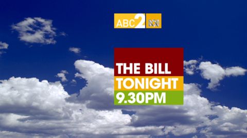
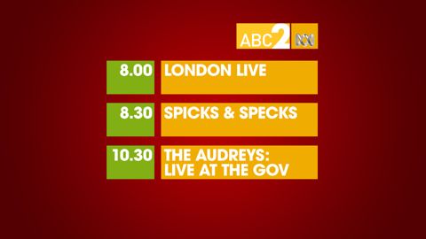
While I was a fan of some of the old ABC2 idents, and am still getting used to the new ones, something about the network that always left me unimpressed was the murky-green-water theme that dominated their promos and other on-air branding. The new ABC2 however has got a fresh coat of paint, and with its bold use of red, green and orange gives a distinctive look, that for me at least gives the network a feeling of independence, and some even footing with ABC1.
The new look was developed by Tactic, check out what they did to ABC1 here.
UPDATE: It turns out the ABC has never had a unifying channel brand like they’ve just adopted, and whats on-air right now isn’t the gold standard that was intended (the third video above for example), so while whats on-air catches up with what was intended, check out the screenshots below for an idea of what we should expect soon.


5 replies on “The red, the green, and the orange of ABC2.”
The blockyness of the graphics reminds me of the revolutionary style that CNN currently uses. I like it a lot.
I can see what they were trying to achieve, ano objection to the colours- a bold and eye-catching choice- but unfortunately they’re not quite there.
They’re not slick enough.
For example, the ‘Today’ menu typeface is mixed in an unattractive way and the boxes look pasted on the background like something out of early 1970s TV graphics.
And that logo. Ugh.
The colour scheme is very similar to the American network: ‘The CW’ http://www.cwtv.com/
From a design point of view I have no issue with the new logos …but a quick trip to the ABC website shows that the whole concept of watermarking television broadcasts is deeply unpopular!
A sentiment with which i fully concur…the “bugs” are redundant and irritatingly intrusive.
The ABC has already toned them down somewhat but I doubtr that will satisfy the ABC audience!
We want them GONE!
I also think the same as the first poster about the CNN-like block design. plus, the color scheme is not bad at all. though I wonder for how long will they keep this design.