> Quicktime H.264
(15.6mb)
> iPod Compatible
(8.1mb)
> Watch in Flash
(4.3mb progressive)

> Quicktime H.264
(12.8mb)
> iPod Compatible
(6.6mb)
> Watch in Flash
(3.9mb progressive)

> Quicktime H.264
(2.8mb)
> iPod Compatible
(1.3mb)
> Watch in Flash
(912kb progressive)
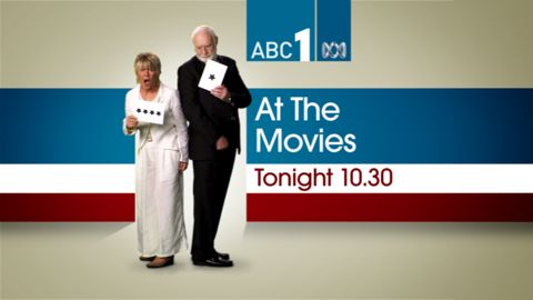
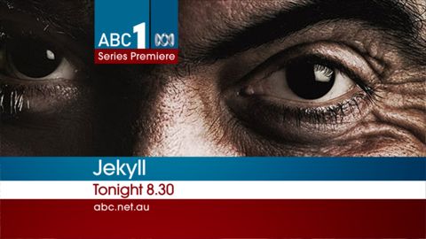
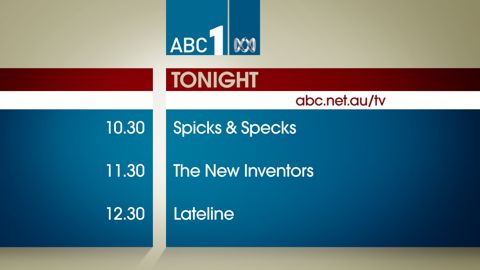
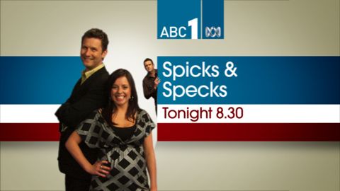
While the new idents make up just part of the ABC1 look, another major factor is the on-air branding of promos and other broadcast materials. The task of developing a new look was left up to Tactic who came up with “a ‘toolkit’ of over 200 channel branding elements including colour palette selection, font selection, on-air promo packaging, supers and menus… The new branding provides the foundations for the ABC to create and produce their own promos and on-air elements.”
Tactic didn’t come up with the new logos, they were supplied by the ABC, but they did do the rest, and while the red, white and blue initially confused me a bit, its beginning to sink in. It’s certainly distinctive and very clean, qualities I tend to find appealing.
Check out the new on-air branding from Tactic for ABC2 here.
UPDATE: It turns out the ABC has never had a unifying channel brand like they’ve just adopted, and as mentioned in comments earlier whats on-air right now isn’t the gold standard that was intended, so while whats on-air catches up with what was intended, check out the screenshots below for an idea of what we should expect soon.


1 reply on “The red, the white and the blue of ABC1.”
i hate the on screen look. too clunky. comparing that to the new (may 09) australia network look – why is ABC1 so awful? the idents, too – just awful!