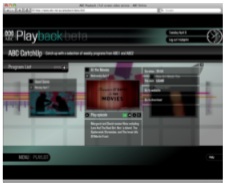
While I was recently reminded of, and amused by the success of the BBC’s video-on-demand iPlayer service in the UK, it did get me thinking about the ABC’s digital ambitions, in particular the National Broadcaster’s recently beta launched iPlayer-like service ABC Playback.
What follows is my take on the ABC’s latest step into the future…
While there currently isn’t much content to play with on the ABC’s beta of Playback, thats really secondary to the usability, design and quality of the service, as no doubt the videos available will jump sharply when the service is running at full steam. That said however, the BBC has revealed that the greatest expense in running the iPlayer service has been creating a back end “that’s able to crank out 400 hours of content each week”, although perhaps the ABC won’t be quite that ambitious in its output.
The quality of the video on Playback is absolutely acceptable by todays standards, high definition would be a waste of resources and bandwidth, and for the average consumer it will be more than enough, and for me watching At The Movies on a 24″ display was comparable to a regular television experience. The use of Flash video means the content is easily available across platforms and for most people won’t even require installing any new software.
Where I think the greatest flaws exist in the service however are in the layout and design of site. The ABC has some great web properties including the recently revamped ABC News site, which I honestly believe is one the best news websites in the world, so why couldn’t the Playback interface take some cues from it?
As it currently exists the ABC Playback site is in Flash overload, and while Flash is great for delivering videos, as a tool for creating successful interfaces it is not. The arbitrary use of channels to break up the programming is unnecessary, and the cute but ultimately pointless carousel that presents a spinning selection of programs will become unbearable when an expanded selection comes online.
YouTube couldn’t possibly of become the success it is if it had implemented a similar all-Flash design, complete with superfluous animations, and a green and black colour scheme.
ABC Playback has the potential to be incredibly successful, and I have no doubt it will be. However I think part of that success will come from ABC Playback becoming a destination in itself for users to not only catch up on their favourite shows, but to also discover new ones, and currently there is no motivation for the visitor to explore beyond a few clicks.
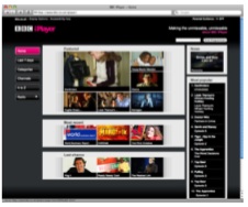
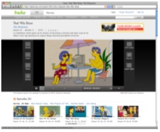
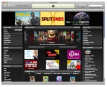
A ready-for-primetime Playback service needs to look to the simpler designs, and fresher looks of Hulu, iTunes, iPlayer, and even YouTube. A lot more functionality could be achieved by adopting a new look that doesn’t rely so heavily on Flash, things like: direct links, podcast subscribing, for keeps downloads, cast details, comments, recommendations, specific program sites, most watched lists, and a raft of other features that are limited by the current look.
While I’m sure this sounds like a lot of criticism, the ABC has a high standard to maintain in its online endeavors, as one of the largest podcasters in the world the National Broadcaster has proven how effective it can be at delivering content over the internet. The launch of Playback will be a first for an Australian television network, and will be important for the ABC to get right.


4 replies on “Playing with ABC Playback.”
I agree wholeheartedly, and I believe they are all valid criticisms. At the moment it has a try hard appearance and shows no real way to see archived programs, only current ones. In saying this, it is step in the right direction. I hope you have also posted this on their feedback forum.
You’re spot on ABC news, it is the greatest news website in the world.
I agree completely. There is no reason to make the UI in Flash – there are plenty of reasons NOT to. The focus should be on the video content, not the UI. I hope they listen to the feedback.
For those of you that don’t know, the ABC released its new internet viewing platform this week:
http://www.abc.net.au/iview/