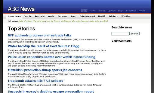
The ABC has been talking about relaunching their news site for a while now, and if the above screenshot I recently received in my email is to be believed you could be looking at a draft of the national broadcasters new news frontpage.
Only time will tell I guess.. click the screenshot for a better look.

8 replies on “Is this the new abc.net.au/news?”
I hope it’s not the final version: the absence of graphics and other media makes it quite unappealing, and doesn’t really exploit the capabilities of ABC’s news gathering services. Along with this better division of news item categories, I would also be hoping for better guidance as to the relative importance of stories; something that seems sorely lacking here.
Hopefully this version is a screenshot of a low-bandwidth version, or something like that…
I guess the photos are still to come. What I think this demonstrates, though, is its small steps towards something Web 2.0-ified. I think.
I hope that’s not the finished version. Minimalism is very good, but that page looks like a news page from the mid 90’s!
It looks like a “holder” design til they phase in the final version.
perhaps its just the “top stories” page that is currently found here:
http://abc.net.au/news/topstories.htm
Probably could be a news page for mobile handsets. Telstra were advertising ABC News with their NextG network…
I usually try to be reasonably restrained when it comes to most things, but that really is terrible – it shows that ABC and its news service in a less-than-pleasant fashion – I can appreciate the simplicity, which is good, but all that really is is text – just like the current one. There isn’t anything to it, no pictures, none of the promised audio/video..
I can guarantee that there will be A LOT of audio/video, as well as images – and these will all be integrated into the site far better than they currently are.
What you see above is simply the template we are using for the top stories page.
Do not panic – wait until you see the finished product and have a surf around it.