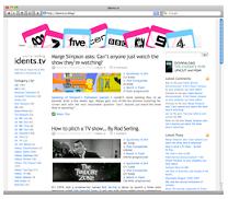
It’s not as drastic a change as I was planning, but idents.tv now looks slightly different! It’s a bit wider, and now has a third column.
If you’re having problems viewing the new design, try holding down shift and pressing refresh in your browser.
The layout had gone unchanged for nearly two years, so hopefully this small freshen up will breathe some new life into the site.
8 replies on “A new look idents.tv, just a “shift+refresh” away.”
Hey like it, I didn’t mind the design you tested either (black one). One suggestion could you try and get the “Subscribe to comments” plugin for WordPress. It’s handy for commenters.
Good job.
…and yes I know the Feed for this Entry thingy, but this is a good feature too 😛
It’s very funky and K2 is syonomous with idents.tv, so the slight refresh is perfect. The tag cloud is very cool too – it’s funny seeing ‘Moloko’ amongst a mass of TV terms.
I think it’s a great refresh of the site design. You’ve managed to implement a lot of information in the outer coloumns without making it look too busy. I think it was wise to retain the fonts and the style of the text as it looks good and suits the blog. Also, the banner at the top is as good today as it always was – it characterises the website well.
Could someone explain to me how the Tag Cloud works, though, please?
It’s looking mighty smooth Mr.
It’s just a case of me adjusting, I’m so used to left-aligned. 😉
Noice. Im actually really glad you didnt change the design too much. i love the simple… nay.. pure visual quality it has.
Way better than the first one….