
> Quicktime H.264
(19.6mb)
> iPod Compatible
(10mb)
> Watch in Flash
(6mb progressive)

> Quicktime H.264
(1.6mb)
> iPod Compatible
(1.1mb)
> Watch in Flash
(762kb progressive)

> Quicktime H.264
(3.1mb)
> iPod Compatible
(1.9mb)
> Watch in Flash
(927kb progressive)

> Quicktime H.264
(1.8mb)
> iPod Compatible
(1.1mb)
> Watch in Flash
(1mb progressive)

> Quicktime H.264
(9.3mb)
> iPod Compatible
(5mb)
> Watch in Flash
(3mb progressive)

> Quicktime H.264
(6mb)
> iPod Compatible
(3.2mb)
> Watch in Flash
(2mb progressive)
Everyone seems to have an opinion about the multicultural broadcaster SBS, which is certainly a better position to be in than having nobody care about you either way. So I’m sure we’re all bound to have something to say about this mornings relaunch of its on air image and logo. As for me, I think its pretty great, and well overdue.
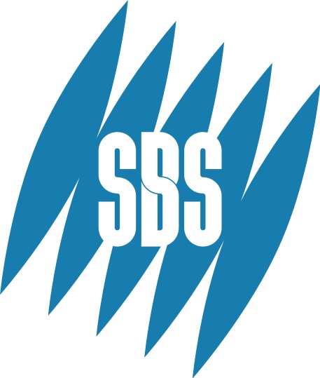
The broadcaster refreshed its still very effective former logo based on the Mercator map, with a slightly more modern interpretation to create what is easily one of the best logos on Australian television (as it battles it out with the Lissajous).
SBS hasn’t been everyones favourite public broadcaster of late, especially thanks to the insertion of advertisements midway through shows, previously only allowed before and after programs. That aside though the network is growing a stable of quality alternative programming, including but not limited to South Park, Mythbusters, Big Love, Skins, Top Gear, and later this year Top Gear Australia. And while the network is still rooted in the obligations of its charter, perhaps this new look is all part of play to become Australia’s equivalent of Channel 4.
Branding was beginning to seem like an after thought to SBS in recent times, with no actual idents on air we were starting to get worried, especially considering the mini masterpieces that had once graced our screens. But it looks like sanity has resumed with these beautifully crafted on air images, a graceful modern logo, and a whole new website.. now if only we can get rid of the ads.
The multicultural broadcaster is now also blogging, with an explanation about the new brand from the networks Director of Marketing available here.
More videos from the relaunch after the jump…

> Quicktime H.264
(20.1mb)
> iPod Compatible
(14mb)
> Watch in Flash
(11mb progressive)

> Quicktime H.264
(11.5mb)
> iPod Compatible
(6mb)
> Watch in Flash
(3.2mb progressive)

> Quicktime H.264
(3mb)
> iPod Compatible
(1.7mb)
> Watch in Flash
(1.2mb progressive)
22 replies on “The always emotive SBS relaunches.”
Oh I just realised: Six Billion Stories = SBS. Very clever!
I quite like what they’ve done with logo. It’s changed, but it’s still the same, at least from some angles!
Tragic. This just looks like the old Foxtel Box Office, with yet another mindless use of After Effects presets. No design here whatsover.
Would look better if “SBS” was next to the newly styled logo and not underneath.
Wow! Some people say you can’t reinvent the wheel, but sure that SBS can reinvent their logo. They pull it off and it works beautifully.
Kudos SBS, you have done it.
Personally I was hoping they would change their logo to how it is in SBS World News, but this is pretty good too. I like the skinny typeface used for “SBS” too.
That looks really good. Really good.
Thats hot! SBS is now the best looking channel in the box.
now all they need to do is get rid of Shaun Brown.
It’s certainly not ‘designed’ which is great … understated, letting the stories do their work. And … it should be flexible enough to also work in a full design treatment too.
No mention of who produced the spots (internally)?
That explains why the idents went missing…
I love the looks, it’s very fresh and clean.
Genius.
18 months of Research and Development using tax payers money,
to come up with an awkward rehash of a classic logo an overlong tag line in an illegible font and some particles from an after effects preset.
Plus the new management squeezed more ads into the channel.
coming next a pointless rehash of BBC’s Top Gear.
Most progressive and meaningful idents on Australian television…
beautiful. makes ABC’s idents look even worse (didn’t think that was possible!).
i love the elegance of it. after some pretty inelegant events on SBS over the last couple of years. very nice to see.
i was hoping they would have one saying ‘my story is classified…M, it contains drug references and adult themes’ (LOL)
Nice idents but the new logo is hardly an improvement. Helvetica… yawn. Where is the risk taking in the graphic mark?
I’m unsure as to why they’d need to take risks with the mark.
WOW!!!! I Wish some people over in brittania could do sumet lyk this
I find it amazing that Australia has an entire public broadcasting organisation devoted to multiculture. I don’t think that exists in any other part of the world. Many countries have some programmes for ethnic minorities, and even some local or digital services for minorities operated by the general public broadcaster, but nothing like a full national television network. I know that many right-wing parties in Europe would go mad if the government decided to launch a multicultural broadcaster.
As for the idents, they are very clean and nice. But the enormous amount of After Effect-esque idents with “cleverly animated” logos that flood the earth nowadays is perhaps getting a bit boring now.
Does anybody know what the song is played just before an ad break? Its like somebody humming or similar. Thanks
Hi Sam,
I think your comment is hilarious and spot on! I am incorporating this side of SBS’s rebranding in my dissertation this year, and am wondering if you have any information on it…how did you know they researched for 18 months etc?
Would love to hear from you!
What is the song at the end with the humming and nice piano playing! realy want to know!!!
You wouldn’t happen to have a higher quality version of this would you?
http://www.youtube.com/watch?v=kQfHAHKVwgI
I agree, I think SBS have some of the most artful idents I’ve seen anywhere.
On that note – what ever happened to the SBS “Shadowland” idents that were used sometime around the late nineties / early 2000’s. I thought they were absolutely stunning.
The director of those idents went on to make a short film in the same style “The Mysterious Explorations of Jasper Morello”, but it seems all trace (online) of the beautiful idents he did for SBS have been lost.
Does anyone out there have a copy to post?