> Quicktime H.264
(8mb)
> iPod Compatible
(3.5mb)
> Watch in Flash
(2.2mb progressive)
> Quicktime H.264
(8.3mb)
> iPod Compatible
(2.9mb)
> Watch in Flash
(2mb progressive)
> Quicktime H.264
(12.3mb)
> iPod Compatible
(5.9mb)
> Watch in Flash
(3.5mb progressive)
> Quicktime H.264
(12.4mb)
> iPod Compatible
(4.5mb)
> Watch in Flash
(3.5mb progressive)
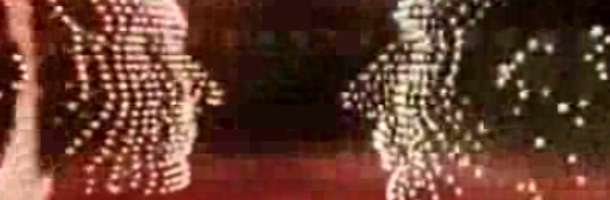
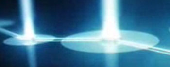
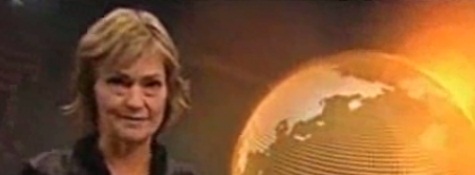
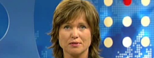
These are a series of openers from various news programs from the Norwegian national broadcaster NRK. The shows in order of appearance above are RedaksjonEN, Standpunkt, Urix and Østnytt.
The entirely CGI sequences keep away from the usual television news trap of using old footage to create drama and instead get an incredible amount of creative mileage from a small dot from the NRK logo that begins each show.
There’s a consistency here I love that makes each program distinctively NRK, which is something that lacks among the various news shows of say the ABC (7.30, Lateline, etc), however its probably debatable as to whether such cohesion between sepereate broadcasts is needed.
Check out more from the license fee funded Norwegian NRK in my earlier post here.
– And another huge thanks to Hans for the videos.
21 replies on “Anything but anarchy from NRK.”
News about Australia on NRK:
http://nrk.no/nyheter/utenriks/1.3744271
I found Østnytt is a local news for Hedmark and Oppland.
Yes it is, I live in Hedmark.
Bloody hell, those are very impressive! Something for the ABC to look to when they next makeover the news bulletins (hopefully by that stage they’ll have a reasonable budget).
Very nice indeed. I will comment on how old all the presenters are! Hahaha.
Also in the last one they seemed to have a bit of cross promotion or reporting on something good happening in their own stable.
Lovely designs, like the way the dot explodes and churns out these designs.
Yes, some of them are quite old. NRK has always been the reliable and trustworthy source of news in Norway. They very rarely introduce new faces to their programmes. And the hosts often seem to be chosen because of their education, experience and knowledge, rather than for their looks. A lot of their hosts have been around for decades, and are very popular. This stands in contrast to TV2. One of their most popular news anchors at the moment is a Pakistani immigrant in her early twenties.
The last headline on “Østnytt” is about the re-branding of NRK2 into a news channel.
These are amazing.
Thank you for sharing them with us…I wonder how do you get these, I mean; how do you get interested in other country’s idents?
I live in Norway, so I record them and send them to John.
I am not sayig the older presenters is a bad thing. In australia the men can keep going on forever but it is a bit rarer to get older women. Not to say there aren’t any. Ann Sanders on 7 who reads the Morning news would be in her 50s and Jennifer Keyte, Jo Hall and Kathy Bowland who read the melbourne weekend editions of the 7, 9 and ABC newses respectively would all be in their 40s.
thanks for your reply hans marius!
Am I the only one who thinks the BBC should be as bold as the NRK? I know, i’m too radical but i’m still dessapointed about the new BBC idents…I was kind of expecting something nicer as these idents…
WOW these openings feature the most impressive graphics of any news programme I ahve ever seen! They are fantastic, and the set design is excellent, too.
–
One thing I hate abotu ABC News here (probably the only thing) is that the set design is small scale, and the camera angles are so tight that the presenters faces fill the whole screen.
–
THe only things I may say I don’t like is that I don’t get what those shapes are supposed to be, particularly in the second opening. Theyare impressive…but what are they? At least there is no ambiguity in the BBC, ITV, ABC etc openings. Maybe Hans coudl enlighten me about wha the shapes represent?
–
One final thing to add – the understated music is spectacular!
The second opening is for a debate show. The show is often based around a poll, and they usually have different polls during the show. Viewers can vote, and they show the resaults at the end of the show. So I can only guess that the shapes are supposed to be poll resaults? If that makes sense. The lights that flow up is one for every big city in Norway, and just before the show title you can see it as a map.
Thanks hans – that makes sense. Beautiful opening. And what an interesting idea for a show. We don’t have a show like that here sadly.
Well, bebate shows are very popular here. The two largest channels, NRK1 and TV2, airs debate shows every day after their main newscast, and they are often in the top ten.
Hans, any idea on who composed the music for these titles? They are Brilliant by the way. Nothing i’ve come across from CNNi, Aljazeera English, BBC World, or even BBC News 24 can match up to this… Thanks for sharing the videos!
Does anyone know the name of the company who rebranded NRK and made these?
Andy OZ:
The second shape is norway, where the lights represent the bigger towns and cities…
Kemistry is the company which has done their branding.
http://www.kemistry.co.uk/
Your older videos no longer have any thumbnails. Too bad this blog isn’t updated as often as it used to be. There’s so much to discover, so much to show.