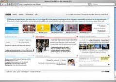
The BBC ran a competition in April/May of this year called Reboot asking for submissions to redesign bbc.co.uk for the new web 2.0 world. I submitted a design on the last day of the competition, and quickly forgot about it… Until yesterday when I got an email informing me that I was one of the ten runners-up!
I’m pretty sure they weren’t too jazzed with my design (heck, I wasn’t), but they did seem to like some of my ideas, the judges said about my submission:
It was the 2 fascinating “social media” ideas here that swung it. The promos for Project: Planet Earth (“six billion volunteers required”). Eat that myspace! And the idea of a collaborative wiki based EastEnders script also stood out.
I’ve been told I win an iPod nano, which is cool, but I’m just excited that my ideas got recognised, it feels good! See my design in all its grainy-jpeg glory here, and of course check out the actual winning design here.

12 replies on “I’m a BBC runner-up! My web 2.0 design came 11th.”
Thats great, but at least they recognised your design.
I’ve just taken a look through a number of the other designs including the winner, and I must say the final design they selected as the winner was quite disapointing. It was overly bland and had no striking visual elements and honestly looked cluttered. Shame they selected that over yous and some of the better designs implimented.
I agree, John’s design was waaaay better than the winner’s, I’m guessing the BBC didn’t want anything drastic. 🙁
John, your design is MUCH better tahnt eh bland and uninspiring design that won!
I love the ‘romantic’ names you have given things – instead of ‘Tv’ it is ‘watch’ and ‘chat’ beomes ‘life’
beautiful!
You should get a job working in the ABC’s Digital and New Media Dept.
Nice work John 🙂
Why do you call yourself as 11th? Reading the text on the BBC-Website: “So the runners up in no particular order are:” means for myself something different.
My Opinion: Really beautiful and nice ideas, especially the welcome message!
Condensation on BBC Four! Amazing!!!
ZOMG, i can’t believe you put “Condensation” on BBC Four! I laughed for a long time.
I finally saw that FG episode yesterday.
I say, your design is a million times better than the winner. The winner design reminds me of the internet in 1998…it has no design at all…your at least had a module system which I think is smart for those like me who visit the BBC site alot.
May I ask you, what will happen to you after this?
oh! and let me add…
you should be proud of yourself to participate in a BBC design…
we all love the BBC design!
I have to agree with almost everyone else on this – the winning entry was bland. I did better in my first experiments with web design when I was 5! Yours was so much better, John!
I’d actually been following the Reboot project for quite some time, but forgot to check it in the last few weeks. Pity yours didn’t win, but congratulations on getting recognised!
Web 2.0 Design Competition now live at:
http://www.veetro.com/Competition.aspx
[…] A few weeks ago I was a runnner up in the BBC’s reboot competition to redesign their home page. My prize was an iPod nano which I recieved from White City last week. But I’m happy with my shuffle, and since I recently celebrated my new found employment by buying my friends 30gb iPods, I thought one of you might like it. Not to devalue the prize the BBC gave me, its frieken awesome, I just thought someone would probably get better use out of it then me. […]