> Quicktime H.264
(9.6mb)
> iPod Compatible
(4.8mb)
> RealPlayer Media
(2.7mb)
> Quicktime H.264
(9.4mb)
> iPod Compatible
(4.7mb)
> RealPlayer Media
(2.7mb)
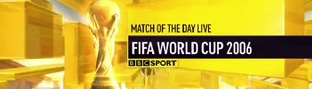
The ITV and BBC branding of the FIFA World Cup 2006.
BBC World Cup (4.8mb) >> To comment and see ITV’s take on the World Cup visit www.idents.tv
> Quicktime H.264
(9.6mb)
> iPod Compatible
(4.8mb)
> RealPlayer Media
(2.7mb)
> Quicktime H.264
(9.4mb)
> iPod Compatible
(4.7mb)
> RealPlayer Media
(2.7mb)
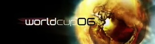
The ITV and BBC branding of the FIFA World Cup 2006.
12 replies on “The World Cup: British Style”
As a football fan, I love the nostalgia of ITV’s, but the BBC’s is very .. BBC :D. I’m impressed with the ident work from Australia’s SBS for this world cup, even though they’ve stolen it from the Academy Awards and Mastercard ..
I think ITV’s 2002 titles were a lot better than these. They were far classier. These days I think computer graphics are over-used for sporting events and they always use the same effects with players super-imposed on the cup or whatever.
The BBC just have so much more class to their coverage than ITV. I reckon ITV’s title sequence is pretty unoriginal and too ‘busy’, plus that version of ‘Heroes’ is terrible.
John, don’t forget ITV cover the world cup as well 🙂
Agree, the ITV titles in 2002 was brilliant it had class and it was more soulful, and nicely sung by the Operababes.
Oops sorry about the previous comment (on the first paragraph) I didn’t read it properly. 😮
There was a bit of a controversy about the BBC’s choice of music for their opening titles when it was announced a month or so ago. It has been adapted from “See The Conquering Hero Comes” by George Handel, which was composed to celebrate one of the most infamous massacres on Scottish soil. Some Scottish politicans were not best pleased.
Its seems like ITV’s presntation department has gone from class to trash in 4 years (well judging by the fact it is ruinied i am not suprised). The titles are supposed to show the posters of the last 6 world cups yet it is completly inacrate.
Well, I think i’ll be the only poster here who will make a diferent opinion than the others.
I was looking forward to take a look at these idents after the Commonwealth games ident videos were posted which really amazed me…this time it was not the same.
like the first poster said…the BBC is the BBC ^^ and everything (almost everything) they do has design and class but i´ve seen this kind of openings before (giant soccer players on the city with orchestral music…really, i´ve seen it before), i thought they would do something more innovative and with more impact (same for the music…soccer is about glory but i would choose other song to describe it, classical or modern). Though, I dare say, the final graphics were great…now I know how the BBC Sport graphic identity works. I hope that the BBC reaches the goal the planned for next year; to improve the BBC Sports department.
As for the ITV, well; some may call it trash but I have to say, I loved how they played with the most recognizable WC designs…yes, sometimes ITV suck at idents but this is better than what they have done before so don´t be so harsh on the poor channel ^^; not everyone can be the BBC ^^;
For the record, there was a Dead Ringers sketch on ITV’s world cup broadcasting where they said they would shoow 90 minites of ad and if your lucky some football! Funny and that was just at the start of the sketch!
Have to say, I think ITV’s opener is brilliant… love the journey through history. Why do the BBC always do the boring grand orchestral music, giant players running through landmarks, etc.
Nice to see something different. Any chance of some video of the actual coverage? Preview show graphics, etc?
Indeed…neverside has done a good opening this time round. But at least with the BBC, you can watch the matches without the fear of stupidy.
ITV is doing the same as every year: picking the worst soundtrack they could find and making, frankly boring, titles. BBC, however, is the absolute opposite. If you think that BBC only plays boring music, you’re sadly mistaken.